On Air Now
Capital Breakfast with Jordan North, Chris Stark and Sian Welby 6am - 10am
31 January 2019, 16:31


Who knew a logo could trigger SO many people?
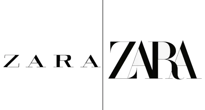
The internet snapped when Zara unveiled their brand new logo and pretty much everyone hates it.
Now, the Spanish fashion brand are known for pushing the envelope when it comes to style, just look at the way the Zara models pose. The new logo, designed by the Baron & Baron agency, pushes the four letters much closer together, which means they're now overlapping.
Zara changed its logo back in 2010, but no-one appeared to have an issue with it because it was very similar to the previous one. But soon people were absolutely dragging the retailer's new design online, branding it "cramped" and crowded, and soon it became a meme.
It makes me feel cramped and crowded and stressed out https://t.co/FIAg8vKBjZ
— Cheryl Wischhover (@CherylAnneNY) January 29, 2019
User's: the new Slack logo was awful
— Abdulsamad Umar (@justabdulsamad) January 27, 2019
ZARA: hold my beer... pic.twitter.com/8NmOK3Pqfp
Zara's new logo is making me claustrophobic. 😨 pic.twitter.com/uSHylbzNCH
— Howard Pinsky (@Pinsky) January 29, 2019
#ZARA Logo then, now and later. pic.twitter.com/OcCYDTdQv5
— Pankaj Ahuja (@panku_) January 29, 2019
#ALDO after #ZARA changed their logo :p pic.twitter.com/0t1AVSUMcS
— Tal (@TALIKIAN) January 30, 2019
Seriously #ZARA, what the hell??
— Silvia Sguotti (@SilviaSguotti) January 30, 2019
You forgot the spaces! #zaralogo #WhatHappened #failrebrand pic.twitter.com/cljuTrp8bS
The new Zara logo is actually me trying to squeeze into their clothes…😰 pic.twitter.com/KNBR5BHg4F
— P.U. 〽️🖌 (@captl_P) January 29, 2019
The new Zara logo is YIKES. pic.twitter.com/UOWz5xDN0C
— Brian Latimer (@briskwalk) January 30, 2019